Hey you!
I took a few weeks off from writing as I am trying to get through the process of getting my O1 visa to move to the US by the end of this year. It’s a long process but luckily I have some very talented lawyers helping me out.
I am strongly thinking about making a ‘‘secret’’ YouTube channel where I talk about the process, moving to the US as a European, and everything that comes with it. I won’t be publicly talking about it, because I strongly feel it’s only relevant for the people interested about moving to the US as well. I don’t care about views for that channel like I do with all the other ones I work on, but even helping a tiny audience of people and make the process easier for them will be worth it for me. If you are someone looking to make the same move, reply to this email! Would love to hear some of your questions.
Anyway, it’s time to dive in the main subject of this newsletter: YouTube thumbnails that did extremely well.
Over the past years, I’ve gathered random outliers that I found where I thought the packaging was great. Sometimes because it broke patterns, and sometimes because it was just executed very well for the topic.
Today I want to share a few of them, and why I think they are extraordinary in their own right. Use this information for the next video you’re making, and I promise you you’ll get a LOT better at thinking about packaging for your video idea.

This is a great thumbnail because of one simple reason: Content hierarchy. The creature in the front gobbles up all the attention from your brain at the first glance, and it opens a curiosity gap:
‘‘Wtf is that thing!?’’
But that’s not the only thing. Wildernesscooking used a proven outlier from another creator to ensure they used a proven composition for their idea. Mike Shake is one of the best creators in the world when it comes to packaging his videos in my humble opinion, and you can see here how they took inspiration from one of his outliers:

It follows the same composition:
Crazy object/action front and in focus
Secondary object blurry off the shoulder in the background
It’s a great thumbnail simply because your attention is grabbed by the craziness happening right at the front, and invites you to analyse it further by looking further back.
Where a lot of creators go wrong is that they make themselves the most important part of a thumbnail, even if the concept itself leans more on the curiosity gap outside of them. Know when to use yourself as the star, and when your idea should take front and center attention for the glance.
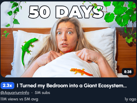
I Turned my Bedroom into a Giant Ecosystem...

I saw this thumbnail when I was doing some outlier research, and it immediately grabbed my attention. The video itself is definitely more catered to kids/teenagers, but the packaging was done extremely well. Here’s why I think this is a great thumbnail:
The expression
Her big eyes and semi-concerned look grabs attention. You immediately have questions:
‘‘Is this thumbnail real? Is she sleeping in between real lizards? She looks concerned.’’
If she had a neutral look, the whole feel of the thumbnail would change. If she laughed, the same would happen. She nailed the expression that fits the overall concept of the video.
The color highlights
She could’ve added some boring sand-colored lizards or some of the bugs, but you can tell she’s a pro:
Two lizards that are very bright in color, and very green leaves to top it off. If you see this thumbnail randomly, her expression and the color highlights will definitely have you do a double take.
The proof
AquariumInfo does something our first outlier also did: find proof to know that your thumbnail composition did well before on YouTube. There’s multiple creators that used this format after her, like Ryan Trahan:

But she uploaded her video late 2023, and this video was uploaded in 2024. So who did she take inspiration from? Or was she the first one to pioneer this format?
Like most of the time, the answer is no.
Actually, it was Ryan who used it before as well for his ‘‘I Tested 1-Star Hotels’’ video.

As you can see, I keep repeating myself:
Find proof → Adjust for your idea → Use it.
Stealing like an artist is encouraged. You don’t want to rip other creators off, but you definitely want to take inspiration from outliers that came before you, and create your own version of that.
Let’s dive into my the last thumbnail I want to share in this newsletter..
I DIDN’T TOUCH THE GROUND FOR 24 HOURS

Now the reason why I wanted to share this thumbnail with you isn’t because it is super crazy or done extremely well in general. Sure, it uses a nice contrasting top in red on her, and it definitely grabs attention, but I wanted to share it for a different reason.
The moment I saw this thumbnail, I knew EXACTLY where the inspiration came from. And it wasn’t from YouTube.
Any guesses?
It was from the Mission Impossible franchise. This shot, to be exact.

And the reason why I am sharing this, is to inspire you to look further than just YouTube. Movie posters that became iconic, scenes in movies that became iconic, music videos.. Everything that has proven to work before is a great starting point for your thumbnails.
So, it’s time to ideate the next thumbnail and get to work. See you in the next one!
PS. If you want to find outlier thumbnails like I do, you might wanna check out 1of10.
Yes, that is an affiliate link, so I also make a bit of money if you decide to join them and up your ideation game!